
It’s 2023 and mobile users are ruling the digital world by accounting for 54% of web traffic. It’s a wild world out there, and for any website development agency or SEO agency, embracing mobile-first design has become an absolute must.
Let’s uncover the magic of mobile-first design! From sharing professional tips to personal insights, this can be your sidekick, arming you with the tools to create mind-blowing, user-centric experiences that transcend the boundaries of devices.
It’s time to make your web presence truly shine and conquer the hearts of users everywhere!
What is mobile-first design?
Think of it as the red carpet treatment for our beloved mobile devices. We start the design process by giving those tiny screens the VIP treatment, ensuring that the most important elements shine like stars. With limited space, you’ve got to be super smart about what you showcase to your users. It’s like a digital adventure where we take users on a journey they’ll never forget. So, roll up your sleeves, and create digital wonders that’ll leave people smiling from ear to ear!
How did the mobile-first design strategy come to be?
Not so long ago, websites were mostly developed assuming users would access them from their desktop computers. As mobile and tablet usage surged, developers attempted to tweak these websites by trimming some features to make them work better on smaller screens. The Graceful Degradation, or Desktop-first, had its merits but also had its downsides. Many web elements didn’t adapt well to the limited real estate of smaller devices, resulting in websites looking messy and awkward on phones and tablets.
In response to this challenge, developers devised a different approach to Progressive Advancement or Mobile-First design. With a mobile-first mindset, designers began the website creation process by focusing on the smallest devices first. This forced them to carefully prioritise essential features and content, ensuring a seamless experience for mobile users.
Gradually, they added more functionalities for larger screen sizes, enhancing the website’s capabilities while maintaining its essence. The Mobile-First design has since become a pivotal cornerstone in creating user-friendly, adaptable, and visually appealing websites for all devices.
Why is mobile-first design critical?
Mobile users make up a whopping 60.43% of the market share. That’s a massive audience that businesses simply can’t afford to ignore. With smartphone users spending around 3 hours and 15 minutes on their phones every day, it’s clear that mobile devices have become an integral part of our routines. Millennials take this to the next level, spending over 5.7 hours on their smartphones. It’s safe to say that the younger generation practically lives their lives on phones.
So, if businesses want to connect with this tech-savvy crowd, they need to offer a top-notch mobile experience. On average, people check their phones almost 58 times a day. Yes, we all are guilty of that quick phone-checker reflex, whether it’s for messages, social media, or simply seeking information.
The mobile-first design ensures that websites and apps are tailored specifically for mobile devices, creating a delightful experience. It’s all about making life easier for users on the go and providing quick access to the information and services they need. Mobile-first designs spark creativity and innovation, inspiring designers to think creatively and come up with visually stunning and user-friendly solutions on those tiny screens.
If you want to make a splash in this mobile-centric world, there’s no way around it but to embrace mobile-first design and unlock the full potential of your digital presence. It’s all about making that personal connection and leaving a lasting impression in a world always on the go.
How to implement a mobile-first approach in product design?
The mobile-first approach is not just a passing trend, it’s all about connecting with real people and making their mobile experience awesome. So here are some friendly pointers on how to make this happen:
-
Step into their shoes:
Put yourself in your user’s shoes and imagine how they live their mobile lives. What do they need, and what challenges do they face? The human touch will guide your design decisions, making your product truly user-centred.
-
Keep it simple:
With those tiny screens, simplicity is the key. Declutter your design and focus on what truly matters. A clean and intuitive interface will make your users feel right at home.
-
Be a multi-screen wonder:
Your product should feel like a chameleon, adapting seamlessly to different screen sizes. Whether it’s a phone or a tablet, your users should feel comfortable no matter where they are.
-
Start small, dream big:
Begin with the essentials for mobile users and then add complexity for large screens. It’s like building a strong foundation that can weather any storm!
-
Trust speed:
Mobile users crave speed like a good cup of coffee. So, optimise your product for lightning-fast loading times. No one likes waiting, especially when they’re on the go!
-
Listen up:
Users are the real experts. Regularly test your mobile designs with real people and gather their feedback. This journey of continuous improvement will keep your product in tune with its ever-changing needs.
Best practices for a mobile-first approach
-
Put the good stuff front and centre:
Just like offering a cold drink on a hot day, prioritise your page content. Give users the most important and engaging stuff first, so they can get what they need without the hassle.
-
A smooth journey ahead:
Think of intuitive navigation as your friendly guide on a sunny beach. Make it easy for users to explore your mobile world, so that they can find what they’re looking for with a breeze.
-
Ban the pop-ups:
Nobody likes unexpected guests crashing a party. The same goes for disruptive pop-ups on mobile screens. Keep it chill and avoid intrusive distractions.
-
Real testing, real results:
Imagine taking your surfboard for a test ride before hitting the eaves. That’s exactly what testing on real devices under real conditions does for your design. It ensures a seamless experience in the wild waters of the digital world.
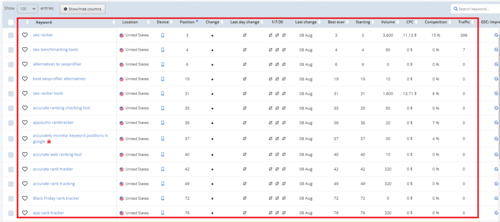
Monitoring Mobile-First Success with TrueRanker
Now that you’re fully immersed in the world of mobile-first design, it’s time to take your strategy to the next level. One crucial aspect of any successful digital venture is tracking your progress and ensuring that your efforts are yielding the desired results. This is where TrueRanker steps in, your ultimate ally in the journey to conquer the mobile landscape.
-
Mobile Keyword Rankings:
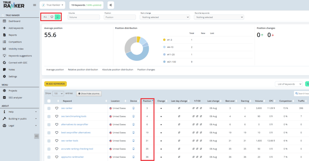
Use TrueRanker to keep a close eye on how your targeted keywords are performing in Google’s mobile search results. This feature allows you to monitor the positions of these keywords over time, giving you a clear picture of your website’s visibility on mobile devices.
-
Mobile vs. Desktop Performance:
Compare your keyword rankings between mobile and desktop searches. TrueRanker enables you to analyze the differences in rankings based on different devices, helping you tailor your mobile-first strategy accordingly.
-
Competitor Analysis:
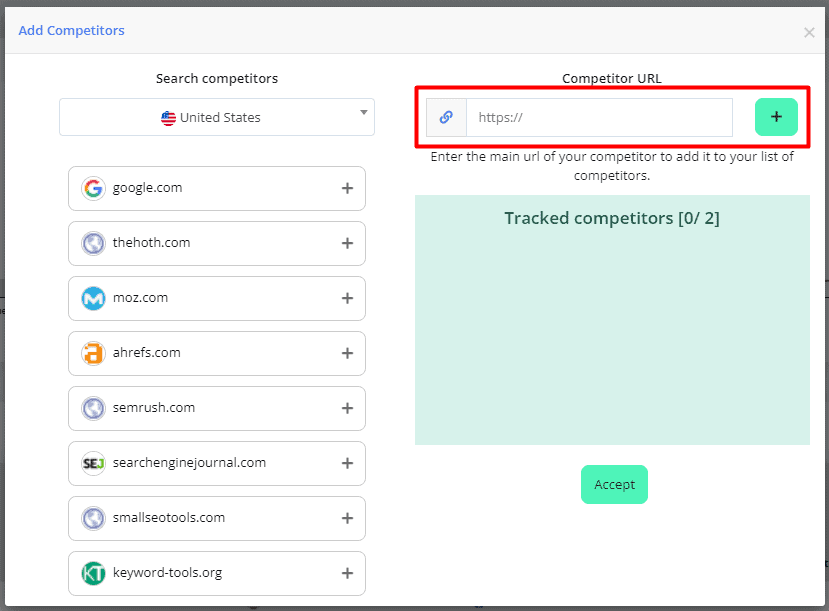
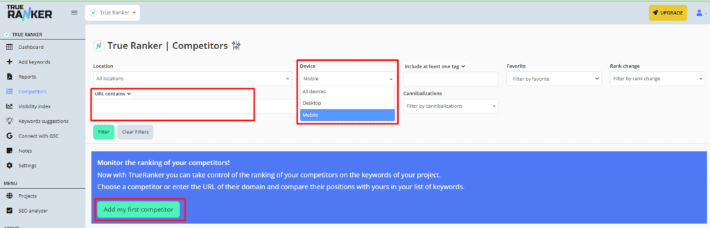
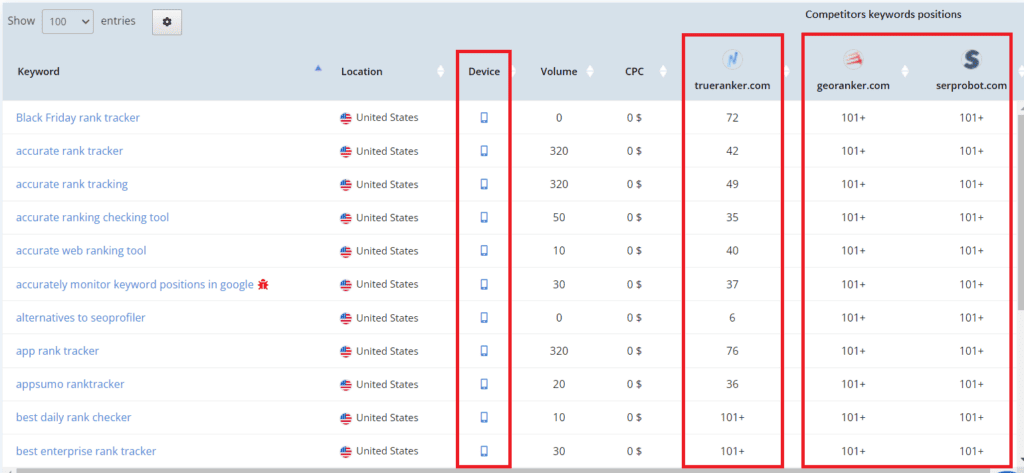
Gain a competitive edge by tracking how your competitors are faring in mobile search rankings. TrueRanker’s competitor analysis tool features empower you with insights to fine-tune your approach and stay ahead in the mobile game.
-
Keyword Performance:
As you focus on mobile-first design, it’s crucial to know how your selected keywords are performing specifically in mobile searches. TrueRanker’s keyword ranking feature helps you see if your optimization efforts are translating into higher mobile visibility.
-
Adaptation Over Time:
The digital landscape is constantly evolving. TrueRanker allows you to track the fluctuations in your keyword rankings on mobile devices, helping you adapt your strategy to changing user behaviours and search engine algorithms.
Incorporating TrueRanker into your mobile-first design journey transforms it from a leap of faith into a data-driven evolution. You can make informed decisions, refine your content, and fine-tune your design by leveraging the insights provided. Embrace TrueRanker, and let it be the compass that guides you to mobile success!
Remember, mobile-first design isn’t just about creating visually appealing websites; it’s about ensuring that those designs resonate with your target audience and drive meaningful interactions. TrueRanker gives you the tools to gauge the impact of your efforts accurately, helping you stay at the forefront of the mobile revolution.
Conclusion:
Mobile-first design is like the sun, illuminating the path to success for the business. Teaming up with a website development agency that truly understands the magic of mobile-first design principles is like finding the perfect surf partner. Together, you ride the wave of best practices, creating mobile experiences that feel like a warm hug on a chilly day!